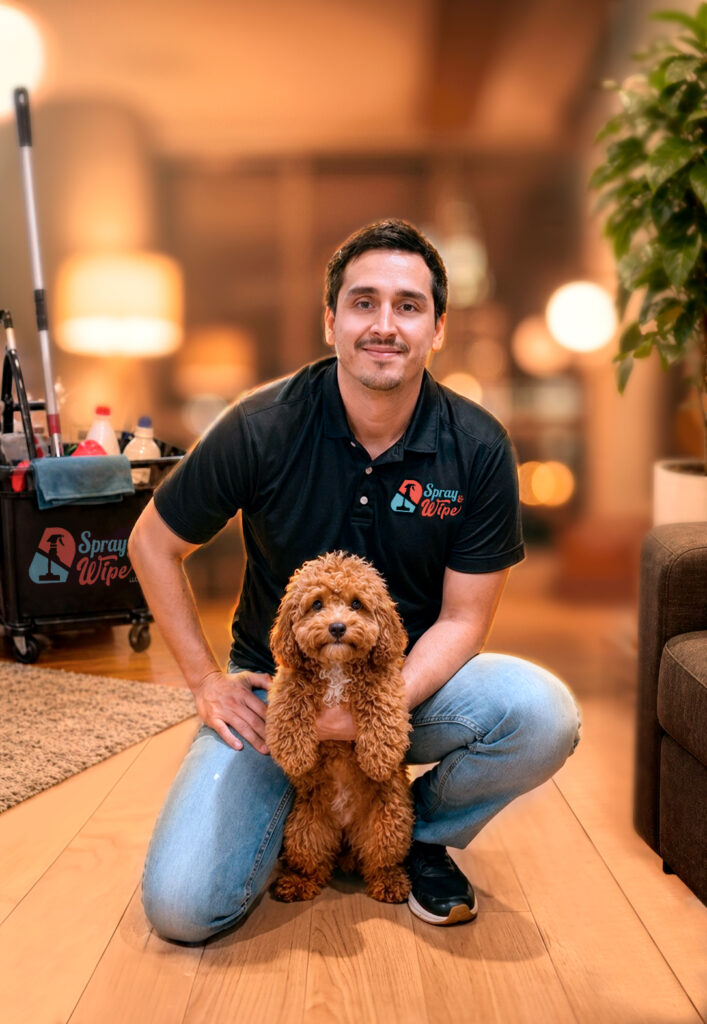
Branding

SPRAY & WIPE

The Client Spray & Wipe is a professional cleaning company based in Brooklyn, New York, serving residential and commercial clients across three of the city’s most competitive boroughs: Brooklyn, Manhattan, and Queens. Its founder, Carlos Saavedra, built the business on one uncompromising principle: quality without shortcuts.

The Problem By the time Carlos reached out, he had already tried to build his visual identity three times, and every attempt ended the same way: something that didn’t look professional, didn’t communicate the trust his service deserved, and that his own clients could sense. This wasn’t just an aesthetic problem. It was a credibility problem.

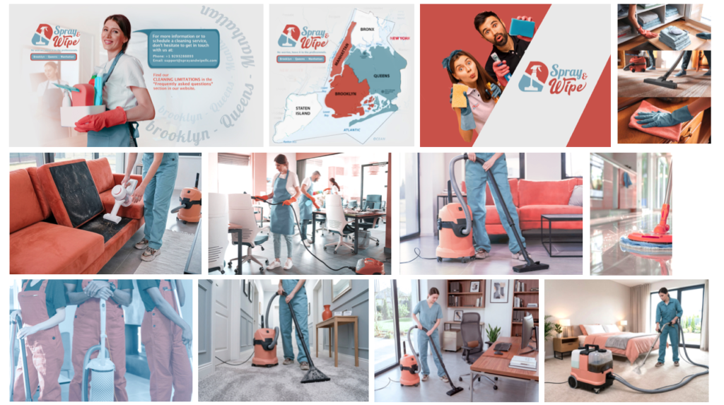
There was an additional layer of complexity: his target market is entirely native English-speaking. A cleaning company operating in New York competes visually against local brands that already speak that cultural language fluently. Carlos’s brand needed to address that audience with visual authority from the very first click, with no room for cultural or aesthetic missteps.

And all of this had to be achieved remotely: the entire project was developed from Ecuador while the client operated in New York.

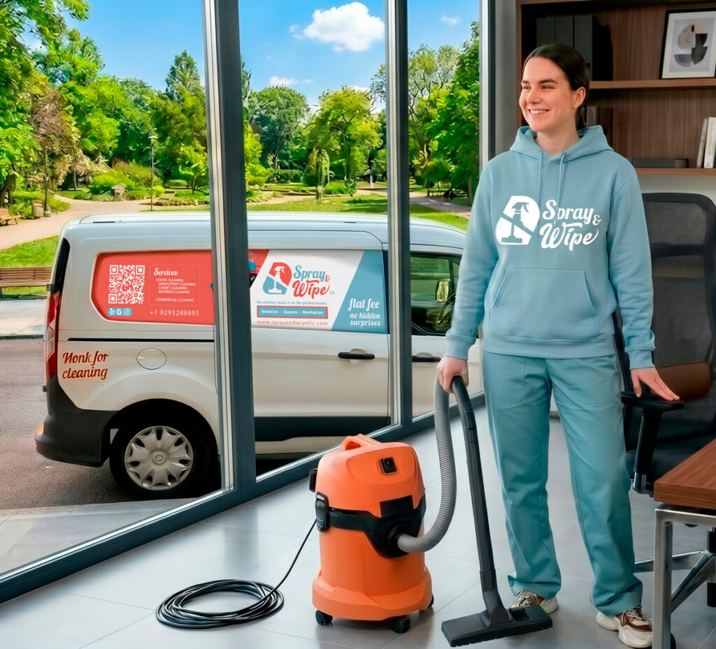
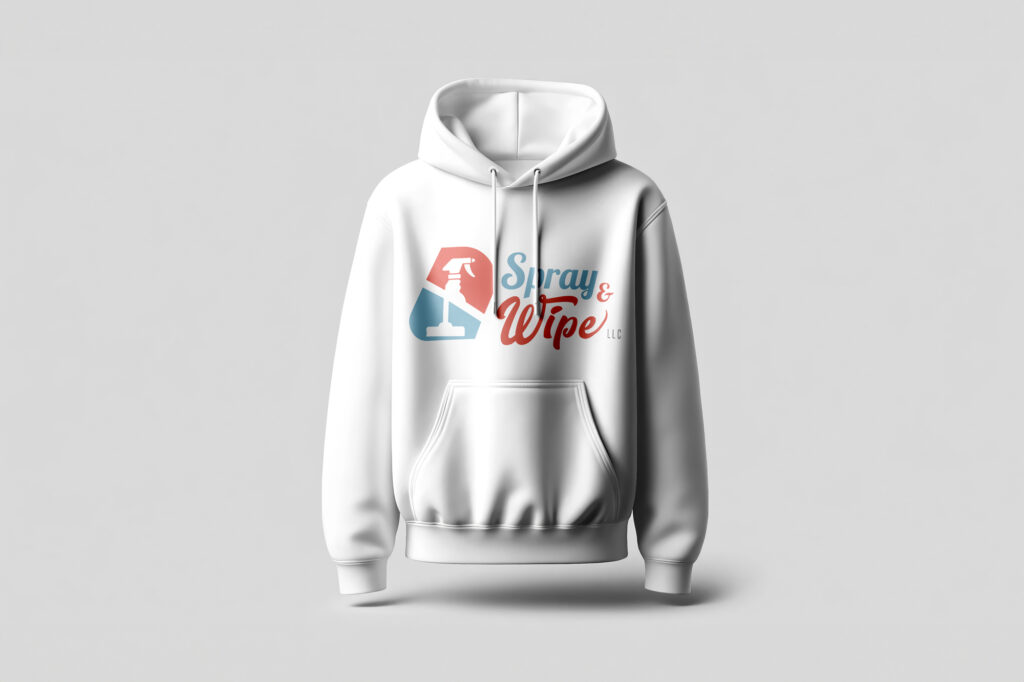
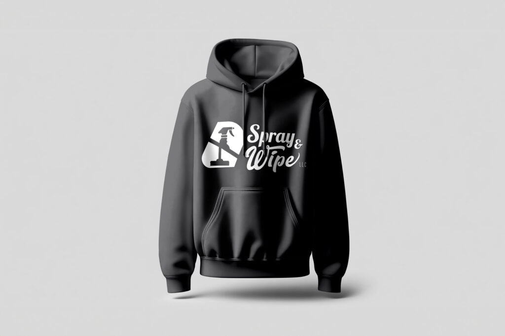
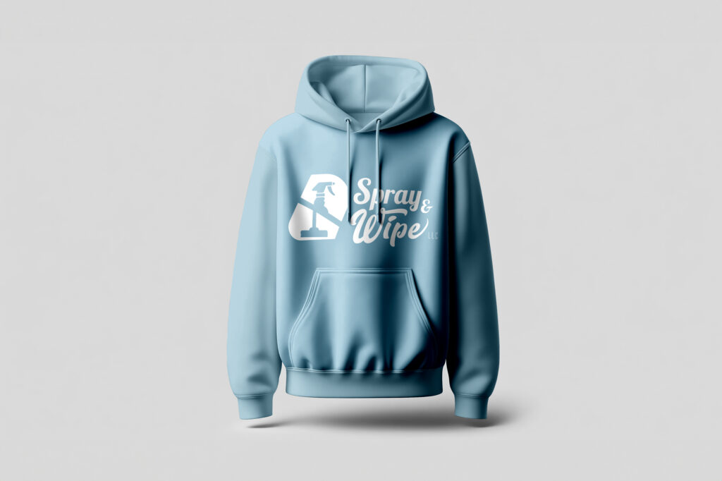
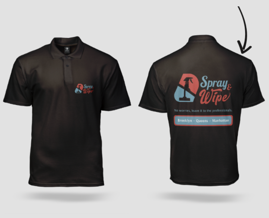
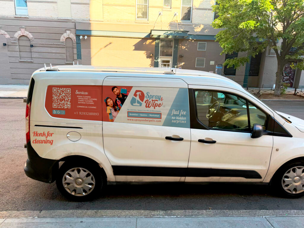
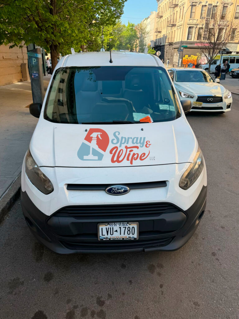
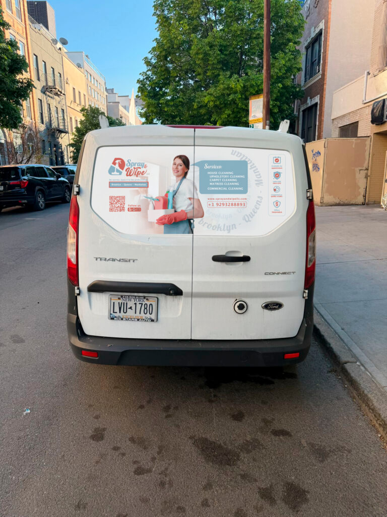
The Solution: A complete visual identity system, plus full website design and layout. This included: logo, color palette, typography, service iconography, apparel design, vehicle vinyl wrap, business cards, edited photography for web, and a digital content architecture built for conversion, all designed so that within ten seconds of landing on the site, a new visitor understands what Spray & Wipe offers, where they operate, and how to get in touch.

The Result → 70% of website visitors book the service directly from the site. → American clients spontaneously praise the brand — it feels native to them. → The digital presence finally reflects the real quality of the service. → A consolidated reputation: 5/5 on Google and Yelp, now backed by visuals that match.

Visual Identity

The visual identity brings together the logo, color palette, typography, and all brand applications, building a cohesive system that works consistently from a uniform to a phone screen.

Apparel Design

Hoodies:

Color psychology was a strategic decision here, not a decorative one.

Light blue conveys purpose, reliability, and trust, the feeling that you can hand something off and know it will be taken care of. Orange communicates optimism, energy, and enthusiasm, the active drive of a team that shows up ready to work. Together, they build a visual message that says: we’re dependable, and we bring our best every time.

Uniforms / T-Shirts:

For higher-intensity work environments, where functionality takes priority, a line of dark t-shirts was developed: a more understated and practical option that still carries the brand’s colors. The balance between identity and function, without sacrificing either.

Vehicle Vinyl Design

(1/4 wrap)

The vehicle is part of the team and part of the brand. The vinyl was designed to create presence without being excessive: clean, legible, and recognizable in motion.

Business Card

Front side: The centered logo reflects the brand’s retro-classic style with a cleaner, more refined treatment, evoking cleanliness without creating visual tension. On the right side, the service areas are subtly integrated into the layout as a design element rather than plain text, inviting curiosity. Two tones, soft gray and muted light blue, create hierarchy without competing.

Back side: A diagonal band running left to right, in soft gray, creates a sense of movement and energy. Inside it: the two iconic logo elements (the spray bottle and the cleaning cloth), the brand tagline in the logo’s typeface, and contact details on the right. Every design choice reinforces a single message: this is professional cleaning.

Website

The website was built around one clear goal: within ten seconds of arriving, a new visitor should understand what Spray & Wipe offers, where they operate, and how to reach them, no friction, no unnecessary text.

Necesitábamos compartir de manera visible todo el esfuerzo y los logros y reconocimientos de calidad de manera sencilla y práctica, sin tanto texto.

To communicate the years of quality achievements and recognition, all that information was condensed into emblem-style badge icons, visual seals that convey authority at a glance, without requiring anyone to read through paragraphs.

Photography & Editing

Photo editing + AI-assisted production

Working across distance presents real challenges, photography being one of the most significant. To overcome it, the process combined a high-quality in-person photograph with technical knowledge of lighting and composition, plus the strategic use of AI-assisted tools that were then refined through professional Photoshop editing.

The goal was never an artificial result, quite the opposite: a warm, cinematic, high-quality image that fully supports the brand, with no trace of the distance it took to create it.

Diseño de fotografía

web y redes

Credits

Project: © Spray & Wipe LLC
Location: New York City – United States of America
Collaboration with: Carlos Saavedra (Founder, Spray & Wipe)
Industry / Sector: Professional Cleaning Services — Brooklyn, Manhattan & Queens

www.sprayandwipellc.com


Services Provided:
• Brand conceptualization and audit
• Strategic branding development
• Full visual identity design
• Website and social media design
• Web photography editing
• Apparel design and print materials


Tools & Software Used:
• Adobe Illustrator
• Adobe Photoshop
• Adobe After Effects

Team & Roles:
• Design, Illustration & Concept: Andrea Jaramillo

Channels:
• Web, Google, Yelp
• Social Media
• Print and stationery
• Apparel (uniforms)
• Vehicle vinyl wrap